A new era at Beyond Face
In today’s blog we wanted to talk about our decision to re-brand over the past several months. In actuality it’s less of a rebrand and more of a re-introduction. Just as we as individuals are constantly maturing, learning and thriving, so have we as an organisation. I’m sure some of you can relate to when the clothing in your wardrobe no longer accurately represents who you are, so you spring clean, re-style, alter or buy items that show off your personality. This sentiment also rings true for Beyond Face, we have reorganised and styled ourselves. Our new exterior displays the result of years of continuous development, from our work with young people to strengthening our place in the sector for writing and producing professional productions.
On our About Us page you can find our new mission and vision, where we have stated our intention to challenge and reframe the narrative around what is perceived as quality, alongside leading the South West into being a recognised cultural region. These are subjects that we will continue to discuss in more detail over the coming months and via our Theory of Change.
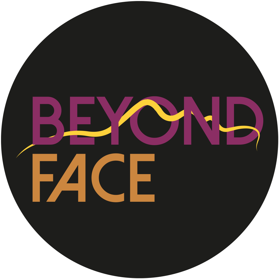
Recently, we introduced our new logo which also has two additional versions featuring either an Artist or Young People badge. This will help you to distinguish between our different offers that includes supporting and acknowledging the work of young people and artists. Whilst young people are one of our main focuses, we are not exclusively a youth company, we also deliver workshops, training and support for developing artists, businesses and educational institutions. Beyond our support offers, we are also artists ourselves and plan to continue making performance work that speaks to stories and subjects we have chosen to explore on stages nationally and across the region.
We couldn't talk about our shiny new logo without discussing the purpose of our colour scheme. The sunflower to plum gradient that you'll see across our website and socials was chosen because we felt like it represents the warmth and brightness of the people we work with. Meaning that it was you that inspired part of our re-brand! You’ll also notice that our face silhouette is still incorporated into the design, as supporting people is at the heart of what we do, simple as that! It also doubles up as a thread that is woven throughout the word Beyond, representing our vision to connect creatives across the region.
Hopefully this blog has provided you with some insight into who we are as an experienced creative organisation. We want this blog to be a space to hold thoughts, whether it's through interviews, sharing what things we’ve learnt or just random check-ins about what's occurring in our community.
Thank you for coming on this journey and please subscribe to our newsletter for company and blog updates.


